What We Did
Branding, Brand & Communication Strategy, Web
The Client
The Client: The Alberta Association of Nurses underwent a new brand identity after CARNA voted to move to a single mandate regulatory organization. This change allowed each organization to better serve their intended audiences. AAN represents and advocates for all nurses with one unified voice, promoting quality health service delivery in the best interest of all Albertans, now and into the future.

The Project
The Association required its own research and stakeholder engagement to help define their new brand, including brand development, brand position, mission, values, voice and tone and then communicated to their members.

Goal
The Association requested that we assist in the research, audit, strategy and planning to help reach their audiences and communicate the change.

Branding
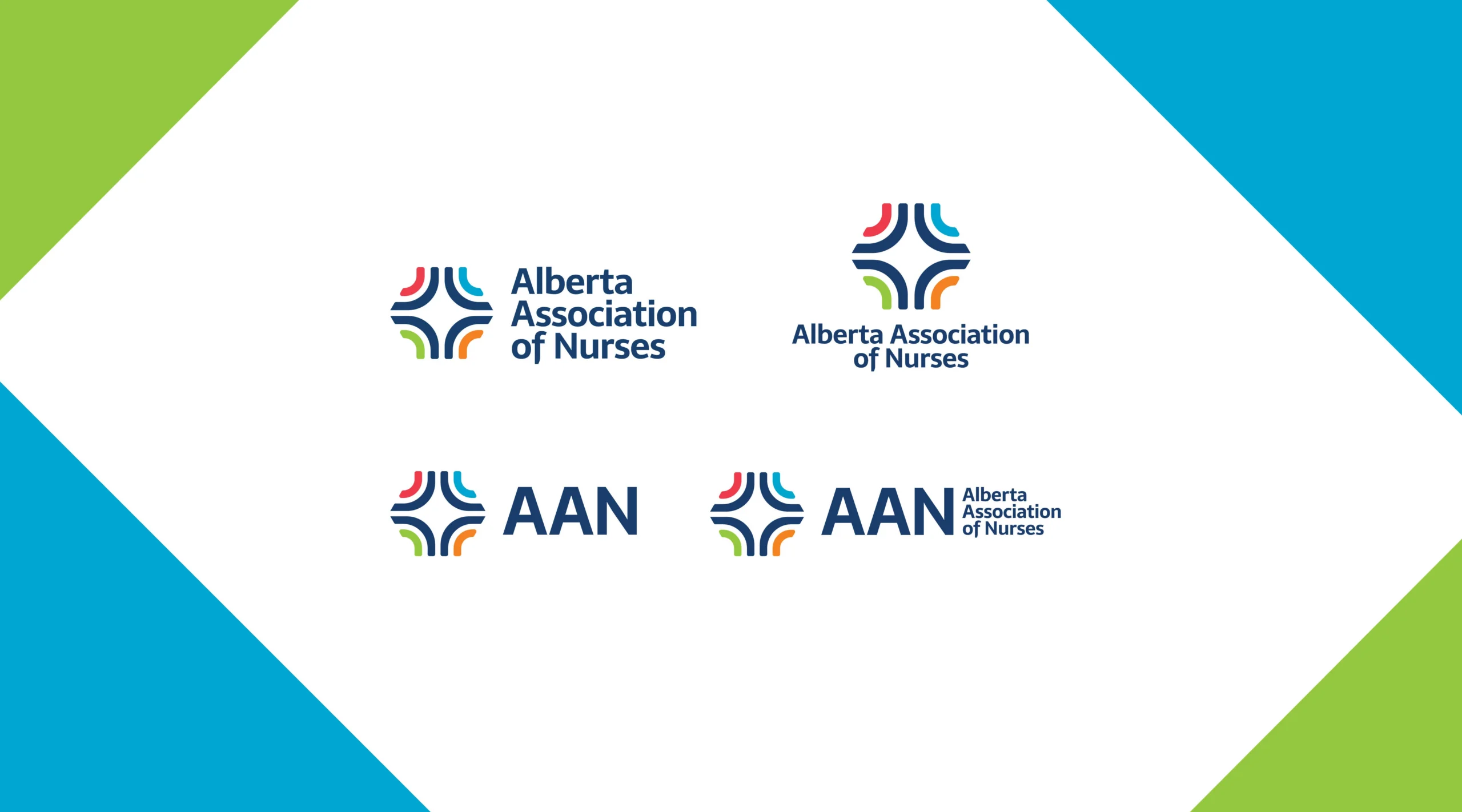
AAN (Alberta Association of Nurses) presents a clear understanding of the organization’s function as an association supporting nurses. The acronym AAN is in general, a marginally used acronym which will facilitate in brand growth and equity.
A colourful logo was created, which has four sides within a hexagon shape. These brightly coloured paths represent the four designations of nurses that AAN represents. The dark blue represents AAN, coming together to represent them, The star in the negative space of the icon represents the communities that all designations of nurses interact daily.